I know that you guys have intended to get rid of backburner goals for a while, but the Beeta redesign brings the issue to a head by not supporting them.
I have a few goals that I backburner because they are never at risk of derailing. (Even if they momentarily have less safety buffer than other goals, the way I use them ensures that derailing is very unlikely.) I track them to collect data and get graphs. I don’t want them mixed in with my other goals.
There is no feature I can find in Beeta that allows similar behavior. (For example, if I could have as many expandable / collapsible groups of goals as I want, and order them however I want, I would no longer care about “backburner” per se.) I can live without backburner goals. But as this is a clear regression, I’m reporting it as a bug.
If there’s a plan to offer some kind of categorization/tagging in the new UI soonish, I could live without the above/below fold feature. But if that is not on the plan it would be nice to retain the fold feature since it’s the only organization mechanism we have (besides using multiple accounts).
Hello! Beeta is now deployed. But fear not - there’s a way to backburner goals, though it’s slightly different. We added basic tagging, which should allow for not only backburnering but a lot of other goal organization.
It’s sort of soft-launched (read: hidden) right now, but if you go to www.beeminder.com/tags you’ll see a list of your goals. You can add a tag like “backburner” to any goal you like, and then if you append a list of tags to the hash of your dashboard URL - https://www.beeminder.com/apb#foo for example - it will only show goals with the tag foo.
And the ordering options are really nice. With the tagging you described, it sounds flexible enough for most goal-organizing needs. It definitely meets mine (though I will note that mine are modest).
I don’t know if it’s a caching thing or something, but going to an address like https://www.beeminder.com/apb#foo does not change my list of goals until I refresh the page.
I’ve noticed that too - I’m not sure if it’s specific to Safari or if that’s actually how browsers are “supposed” to behave. In any case the UI will hide/show goals dynamically.
I’ve noticed it too, in Chrome (so it isn’t Safari-specific). It takes two returns after entering the URI to get a refresh.
Other minor niggles:
The goal name is no longer shown anywhere; every view uses the slug. This can be unfortunate if someone chooses fairly arcane slugs for their goals. Mine are pretty straightforward, but I’d been using the goal name field to signal the Complice goal that graph was related to (so, for example, all my exercise-related goals have a name like [BAD@80] pushups; all my language-related goals have a name like [POLYGLOT] Mandarin).
The goal description and fine print are no longer visible to others, even if the user has checked them to be visible.
It looks like right now tags are invisible and are only used for filtering? I really hope it ends up being the case that tags are visible on the dashboard screen.
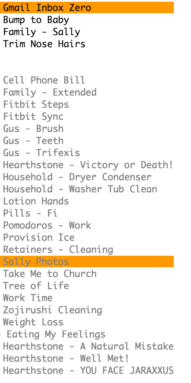
To explain what I mean, have a look at my list of goal names:
Everything before a - is logically a tag. e.g. Family, Gus, Hearthstone, Household, etc… I desperately want to see these prefixes on my dashboard. But unfortunately I didn’t develop the scheme until I’d used Beeminder for a while, so most of the slugs don’t have the prefixes.
My point being that filtering using invisible tags doesn’t help me much because what I’m missing is organization.
I noticed the problem of invisible tags when I was thinking about how to do this. The problem is there’s just very little room on the dashboard for much more text, and if you consider that a goal could have a large number of tags, it gets pretty unwieldy pretty fast.
What I was picturing is at the top of the screen there’s a list of all tags, each with a checkbox, and as you tick/untick each, the goals update below. It still wouldn’t have the tags next to the goals, though, which I think is what you’re really after.
Right. If you forget about tags for a moment, I want to be able to have the goal “name” be within a namespace/context. So I want to be able to have 3 goals all named “Brush”. One is in the context of my dog, one in the context of my baby, and one in the context of myself. Today I do this by naming them “Gus - Brush”, “Baby - Brush”, etc. With slugs I have to make it GUS_BRUSH, BABY_BRUSH, etc. which fill the gallery with underscores.
The current design of tags don’t let me remove the prefixes from my goalnames. Because the namespaced names of these goals are all BRUSH but I can’t have duplicate slugs or assign slugs to a namespace.
Somewhere, like the account menu, we’ll link to beeminder.com/tags and probably will show them in the Settings tab for individual goals. But if you never happen to set any tags, maybe the dashboard should not show anything at all tag-related. That way newbees can be blissfully ignorant of it when they only have a few goals – no incremental clutter.
Except I generally hate magically suppressing UI elements based on user-specific state, so probably never mind. As much sense as that makes, should probably be resisted on principle. Maybe the place where tag filtering would be could be replaced with a small, subtle “no tags yet” so there’s no magical suppression but minimal clutter for newbees for whom tags are wholly irrelevant.
I actually think you could make tags way more important on the dashboard than that and have a top level expandable view per tag (if there are any tags, of course). Possibly with an ultra-minimized view of the goals visible without expanding it (maybe just the name and a color for safe days).
Whatever you end up doing, I’d like to be able to use the tags for grouping, not just filtering. I want to have a view where the tags are used somehow to sort / group the goals, but all goals are visible regardless of their tags.
Words are harder to insta-parse than visuals for me, and I suspect for lots of people. So maybe there’s a way to reduce the wordage in +0.14 due tonight, 12:00am or pay $5 without losing the salient information. (I understand that the full sentence helps new users instantly understand, but people are only new users for a short while. And once you know how BM works, this full sentence is a wall of text that actually obscures the important information, at least for me.)
14 1 "2016-10-14 CompliceArbitraryDo... is not information I need on my dashboard, and I suspect that’s true for lots of longer-term BM users, especially those who use autodata entry. On the dashboard, this space might be better devoted to goal organization (ie, the goal’s tags). That said, I am an akratic user for most of my goals, rather than a QS user, so I may be failing to see the QS argument for this field.
That’s true, especially if people use long tag names like backburner (I try to keep mine to four or fewer chars, and that one’s bb for me). But there will always be a boundary to bump into in designing your design, things that make the cut and things that don’t. You’re truncating the last data point field now (and the goal slug); you could do the same for the tag field, showing what fits into the available space with an indicator that there are more tags that aren’t visible.
TL;DR: Tags are a more valuable use of the available dashboard space than the full-text version of the derail info and way more valuable than the last data point.
(*) For the astute observer, yep, there’s a wee bug in the screenshot I posted—the text has updated to today’s context, but the hexagram color and the check mark for data entered today haven’t. It takes a refresh to update those. I’ll post this as a bug report.
(It’s shown in both the upper right-hand corner and the right-hand data entry field.) So I think that’s an argument for using the space in the compact view for tags, even from the QS perspective.
This.
In an ideal world, this is exactly how I would like to use tags/groups in beeminder.
I am just quoting this in order to make it more explicit that this idea is being “voted up”