The view on https://www.beeminder.com/username whether collapsed/expanded shows the goal name, urgency, recent data. It doesn’t however show you the current commitment for each goal. Is there a view that shows me at a glance how much I have committed to each goal.
Obviously nothing critical here. I can do without it by opening each goal in a new tab.
By “commitment” you mean the current pledge? That’s written on the graph itself, but faintly:
So this goal has a $10 pledge level right now, for example.
Hi, thanks for checking. By commitment I mean the current value on the commitment dial, as seen on the goal page. While I can see it clearly at the top of the commitment tab, it is missing from the overview page that shows all goals together i.e. beeminder.com/username.
Ah, that makes sense! I think we’re wary of confusing people with too much info; the most important thing (the amount due at your next deadline) is displayed on the dashboard, and we’d be wary of adding something else that draws people’s attention away from that. Could you tell us more about the use-case for needing to see what your commitment is from the dashboard? It’d be useful to understand what it’s needed for, in order to prioritise it better.
How much time I have committed to different goals to ensure that the time reflects each goal’s importance and not the other way round.
And, the total time I have committed to different subsets of goals (health, work etc) to ensure that I am within physically possible limits on work days and off days
Given that the commitment dial appears prominently on the goal’s landing page/tab, one could nitpick that it deserves mention on the overview page as well. At the same time, I admit such a review is not a daily affair.
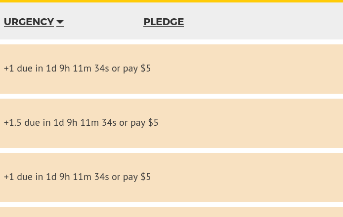
And while we’re at it, the pledge column on the overview page seems unnecessary as the value is clubbed with the previous:
OK so maybe one could swap out the “Pledge” column for a “Commitment” column?
@shanaqui 's question is still valid, though, as you’d have to decide if you wanted today’s commitment, which would be 0 if you are on a break for example, or the ongoing commitment, to allow you to take a more strategic view over (in your example) total hours/day allocated to being healthy, or whatever.
For the strategic view, I was considering the ongoing commitment. From @shanaqui’s reply I gather that the column header has a purpose, even though the column itself is merged into the previous. So swapping it out may not be an obvious alternative.
I was thinking: but surely, there must be somewhere a view of the goals that shows all the relevant rates in one place. Maybe in the breaks interface? Somewhere else on the website? I surely have seen that somewhere, because otherwise it feels like I would be missing it as well.
And then I realized that I have seen it somewhere because it’s part of my custom script. Here’s more about my concept, with a shareable code version. There were also some other custom solutions from other users, including one that let evaluate how much time, on average, it takes to achieve a +1 on each goal, and then converted everything into time - I found that extremely illuminating as well, I never thought that dealing with my goals is supposed to take up so much time of my life (but I am basically beeminding almost all meaningful things in my life, so it’s understandable).
I think something like that will be key to having a meaningful / useful / comparable column on the dashboard. The literal committed slope numbers themselves carry very little information about what that commitment means in terms of time or opportunity cost.
I think that’s why the community developed indicators like urgency-load that is expressed in terms of days of safety.