Seems like the Uluc lobbying has won?
This is what I get →

3 Likes
I don’t really have an eye for design, but: 1) I am anti-hard green boundary at 7, but 2) what does a gradient look like?
3 Likes

lol, I think he meant on the graph
2 Likes
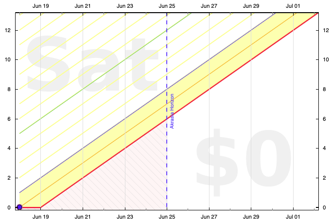
That’s like “as of”, as in, the date the data is plotted as of. Or what counted as today, as of when the graph was generated. Very gory details in GitHub! GitHub - beeminder/road: Beebrain and Visual Graph Editor
Yeah, I think having the good side green and the bad side red is going to look best. Much fainter green and red, but, yes. Remaining aesthetic things to work out are:
- indicating 7 days of buffer. yellow line? darker green?
- fixing the off-by-one error with the regions
- new way to indicate the oinkzone nee pinkzone (or maybe it should be called the anti-akrasia zone? nozone? it’s the region you can’t let the road intersect when editing the road)
Ooh, smart. Possibly easier said than done to make the gradient fade parallel to the road?
The one thing that makes me think I wouldn’t like the gradient is that I like being able to see distinct regions in the graph as reference points, like “where yellow turns to green is n days of buffer” or “where light green turns to dark green is n days of buffer.” So stair stepping appeals to me more than a gradient.
1 Like
well I think the gradient would just be for the very last region. so you’d still get the stairstepping for the other distinct regions, but the very last region (> 7 days or whatever) would fade out.
I agree that there should be stairstepping for the other distinct regions.
Zedmango’s got what I intended 
1 Like


It now seems we have two types of green !

1 Like
@dreev bug or new design ?

By the way, it was more satisfying to see the area above the green line be , well, green, rather than the new yellow stripes
1 Like
Experimentation! Shading the whole regions makes a ton of sense semantically but looked a little garish. By the Pareto Dominance Principle we figure we want to launch YBHP with the graphs as similar as possible to the status quo. Then we can think about bringing back the colored regions. Thanks to @saranli it’s getting very easy to experiment now…
The following defines how all the regions and the boundaries between them are colored. A region is defined from d to D days to derailment (if d=D it’s a region boundary, i.e., an isoline of the the DTD function), using fill-color fcolor, stroke-color scolor, stroke-width w, and fill-opacity op. Finally, xrange, a list like [xmin, xmax], gives the x-axis range to apply it to. If xrange is null we use [-infinity, infinity].
xrfull = [goal.tini, goal.tfin]          // x-axis range tini-tfin
xrakr  = [goal.asof, goal.asof+7*bu.SID] // now to akrasia horiz.
lgreen = "#cceecc" // light green region
dgreen = "#b2e5b2" // dark green region
bgreen = "#00aa00" // bright green same as GRNDOT for green dots
lyello = "#ffff88" // light yellow same as LYEL for classic YBR
lblue  = "#e5e5ff" // light blue region
bblue  = "#3f3fff" // bright blue same as BLUDOT for blue dots
lorang = "#fff1d8" // light orange
borang = "#ffa500" // bright orange same as ORNDOT for orange dots
pink   = "#ffe5e5" // pink for nozone/oinkzone or bad side of YBR

//[ d,  D, fcolor, scolor,   w,  op, xrange] <-- region color definition
//----------------------------------------------------------------------
//[ 6, -1, dgreen,    "none",   0,   1, xrfull],  // dark green region
  [ 6,  6, "none",    bgreen, 1.5,   1, xrfull],  // 1-week guiding line
//[ 2,  6, lgreen,    "none",   0,   1, xrfull],  // green region
  [ 2,  2, "none",    bblue,  1.5,   1, xrfull],  // blue line
//[ 1,  2, lblue,     "none",   0,   1, xrfull],  // blue region
  [ 1,  1, "none",    borang, 1.5,   1, xrfull],  // orange line
//[ 0,  1, lorang,    "none",   0,   1, xrfull],  // orange region
  [ 0,  2, lyello,    "none",   0, 0.5, xrfull],  // YBR equivalent
//[ 0, -2, pink,      "none",   0,   1, null],    // entire wrong side
3 Likes
What would be the possible degradation by improving the colours used in the graphs? Are there any users that consider yellow to be a more positive colour than green? ![]()
Relevant:
1 Like
My green is much less saturated (a rather weak #EDFFD8) and I like your green better. The halfplane is greener on the other side of the fence maybe. For what little it’s worth, my green also fills the whole half-plane.
More serious, but possibly very random point brought to mind by your isolines (which go away in flat periods, right?): have you ever considered losing the derail flat period and just having the line drop immediately to the point where you have 7 days buffer? I’m not sure how much if at all this is connected with your halfplane work because I’ve not had to implement this stuff without the halfplane and I have no do-less – but I think it has worked better for me that way because I can no longer ignore the goal in flat periods (not to mention simpler).
1 Like
The important parts of this thread are now in the blog!
https://blog.beeminder.com/ybhp
And this is a placeholder to remind myself to collect some before-and-after shots of some graphs for posterity. I found this one from the very early days, maybe from pre-launch, generated by Mathematica:

PS:
Before (do-more):

After (do-more):
Before (do-less):

After (do-less):


