I have been experimenting with returning do-less goals into my usage. I understand that they demand a lot of special clauses to work on par with more conventional goal types (which is why their development originally lagged behind and I initially cycled them out of my usage years ago). Here are two unexpected behaviours with a do-less goal that is supposed to do a lot of auto-ratcheting.
- Limit for today - I believe some rounding problem for the display.
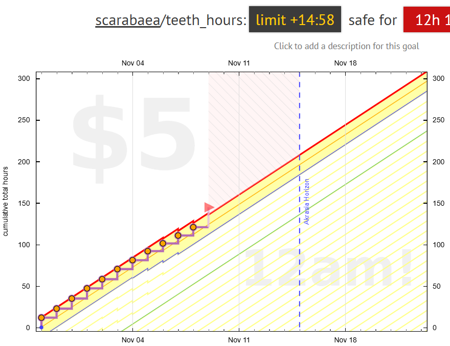
I have auto-ratchet set to 15, and it is clear from the graph that the buffer was over that at the beginning of today’s calendar day, so an auto-ratchet happened… So, I would expect today’s “limit” to be 15:00, not 14:58. At least, from the road settings I see that if I had “15” as today’s value, that would fit under the wire:
-
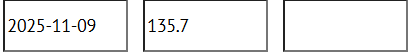
NOW 2025-11-09 → 120:42
-
So it would be nice to have the info above the graph to reflect that, to avoid confusion.
- The second is related to the interactive graph. From the non-interactive graph above, I can see that I am only in the red because of the PPR, so I haven’t actually derailed yet. If my value for today will be under 15, I won’t derail.
Interactive graph, however, suggests that I have already derailed, as if the PPR value is definitive.
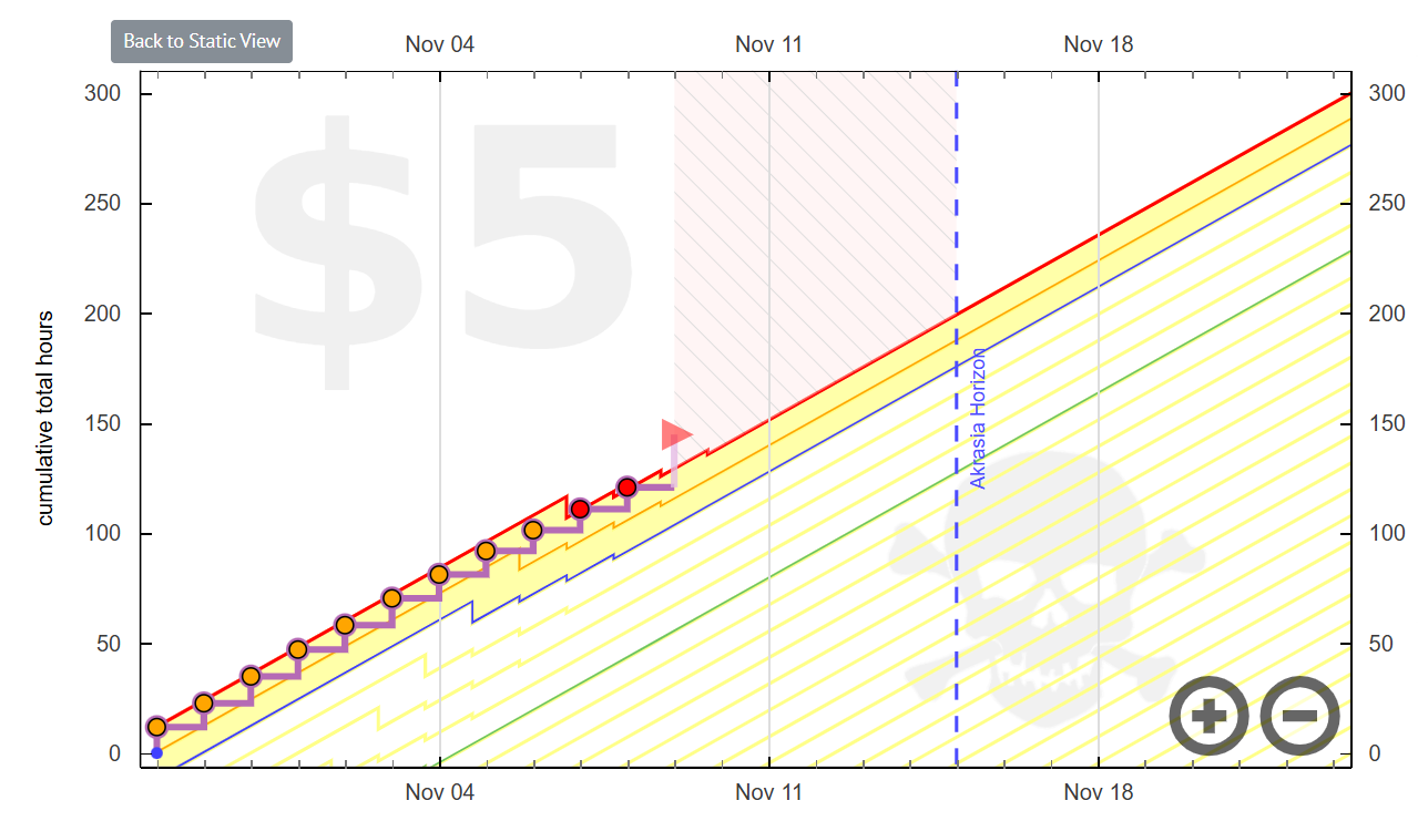
Or - I am noticing just now - is that because it believes the datapoints for a few past days to be in the red? (In fact they were so low that autoratchet was triggered every day.) I started writing this to point that the “derailed” mark is wrong on the interactive do-less graph, but now I am seeing that it is off in even more ways than that. The two graphs don’t really map onto each other, as, I hope is clear from these two screenshots. And somehow the autoratchets are between the dates on the interactive graph?
I understand that interactive graphs are still a work in progress, and these issues are, perhaps, known items on the to-do list - but maybe it would be better to put a disclaimer that do-less interactive graphs are not ready yet, like it is for the “#tare” graphs right now.