This is a rather small bug, but one that persistently bothers me.
I think it’s a bug, at least.
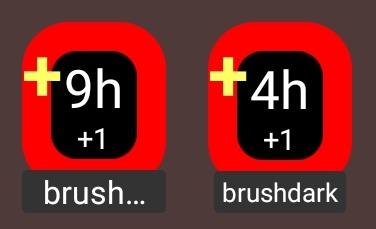
I have two goals for toothbrushing, brushday and brushdark, and I have widgets for them:

As you can see, “brushdark” is fully visible, whereas “brushday”—which by all rights is shorter than its companion—is at a larger font size and gets ellipsised.
I have two rough guesses, which may or may not have anything to do with what’s going on here: a “use a smaller font size” threshold exists and is wider than a “get cut off” threshold, leaving a few specific lengths in this awkward in-between? Possibly the fact that “brushday” has both ascenders and descenders is affecting some sort of “the smaller font size would make it too small vertically” heuristic?
I’m not sure about that, but I sure would like to see both goalnames if it’s not just an unfortunate side effect of an otherwise very sensible strategy!