What do you all think? I guess I primed you by calling it gorgeous but be honest! One of the founders of Falken Creative put that together just out of love (or I guess the combination of the love of Beeminder’s functionality and hatred for our current design!) and I don’t know how soon if ever we’ll be able to afford to actually implement it, but the more enthusiastic you superfans are, the sooner / more likely that will be.
Also if you agree it’s gorgeous and have design work you need done yourself, I certainly recommend Falken Creative based on my interaction with them so far!
I like the general public site pages. In the web app section I especially like the filters/categorization in the web app (guess that would be new-ish functionality rather than just reskinning/rearranging stuff though).
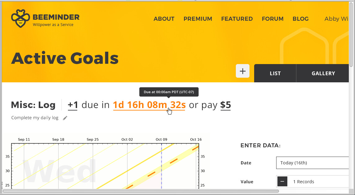
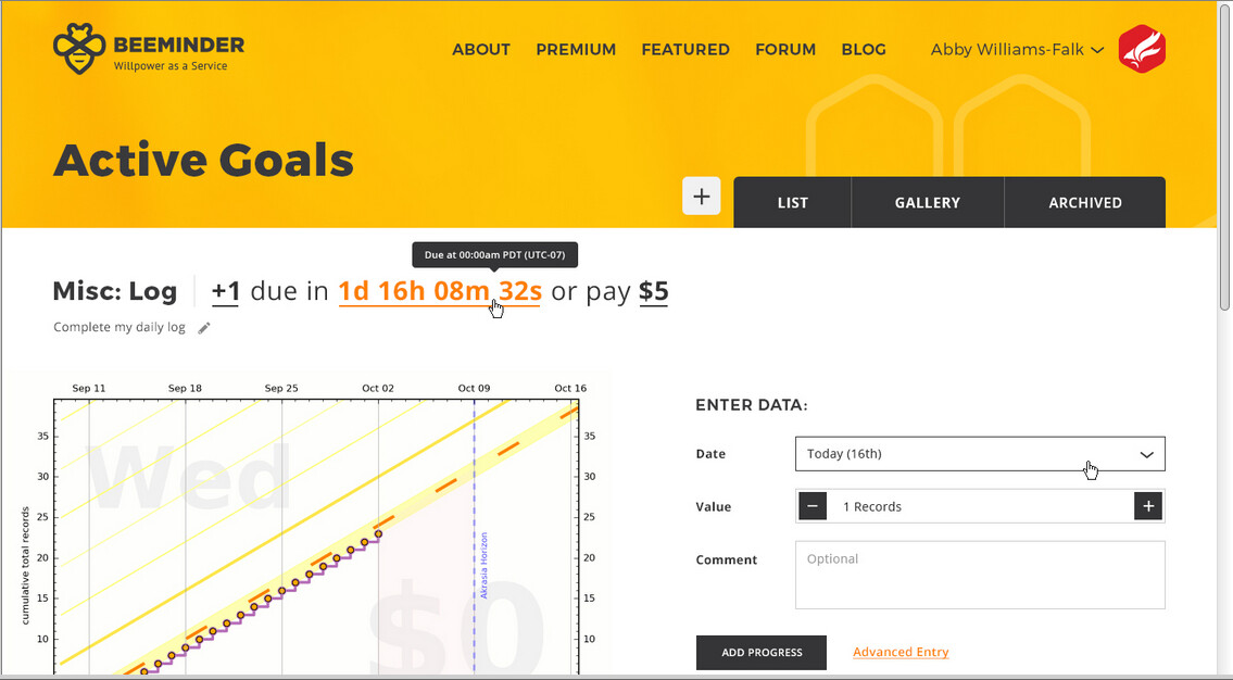
My biggest piece of critical feedback is: in the web app goal list page, the header + title + tabs + filters have now pushed the goal table so far down the page. Looks wonderful, but I personally prefer the info to be more ‘front and center’ and not halfway down the page + out of view; especially on something that is more of a ‘dashboard’.
But in general, I’m a fan of how cohesive and consistent everything is and the design accents like soft hexagons on the team photos.
Hmmm. It looks like they’re making some assumptions about screen size that don’t apply to me. When I view the sample pages in my normal browser window, the right-hand side of the pages is cut off. I have to scroll horizontally to see everything or zoom out twice for a horizontal fit.
The header is huge too, with a lot of unused space, while the bottom of the graph is below the fold even after zooming out twice.
I’d rather have more of the content visible without zooming out, than prettier.
Wow, they’ve done a great job! Being a front-end developer, I usually have no end of opinions on things like this, but they’ve done a solid job here, so I only have a few pieces of feedback.
I’m not crazy about the multi-column layout in goal settings. Feels like it would make it significantly harder to scan the page for the setting I want. If you really want to go with a multi-column layout in settings, I’d suggest at least testing multi-column vs single-column with users first to make sure you’re not introducing a usability problem.
Given how many integrations Beeminder has (and growing!), I would hope that the drop-down on the new-goal page can have a built-in filter box.
I realize that all these pages are just images, not HTML mocks, but I do hope this would be implemented as a fully-responsive website that is viewable at any arbitrary screen resolution between a small phone and a huge desktop. I think the pages where this would take the most work to achieve would be the dashboard and the individual goal page. For that reason, if I were managing this project, I’d ask them to provide phone and tablet variations for these pages, making clear that I want them to include all the functionality of the desktop version in the narrower variations. This will make it easier for the developer to build these pages to adapt to every possible viewport size from phone to giant monitor.
Hello all! Designer of the mockups here. Thanks to @dreev for sharing, and everyone for their feedback!
@blatherwock - I definitely agree that vertical space is a challenge for the app side of the designs, and the current header may be too tall (especially compared to the current design). I usually lean towards consistency and having more white space, since I think it looks better visually, but I do think that the app designs could use another look to tighten up spacing in places, or maybe even re-think the header entirely so less scrolling is needed.
@alys@narthur - Correct, these designs are just static image mockups for now, and basically just represent the starting point of a design project, not necessarily the finished design (mostly because they were put together without any feedback from the Beeminder team). My usual design process is a lot more collaborative.
@Alys You’re right – these designs make some initial screen size assumptions, and you just happen to be using smaller size device (maybe an older laptop? or a tablet?) that these specific designs aren’t quite built for. Seeing that header on your device definitely makes me think that it needs to be half the size or less.
I’m initially designing the site at the widest it would appear, for larger desktop devices, but ideally the final designs would also include samples for phone and tablet devices, and the final coded site would be fully responsive and adapt to the size of whatever device was viewing the site.
I’m viewing it in a 20" browser window on a 27" screen and all the elements are fully visible and look very balanced, with everything that I’d consider above the fold showing without scrolling. It looks like I’d be able to see up to six goals on the “dashboard” without scrolling, compared to about nine goals in the current design (I’m assuming the design of the mobile app is a completely different animal?)
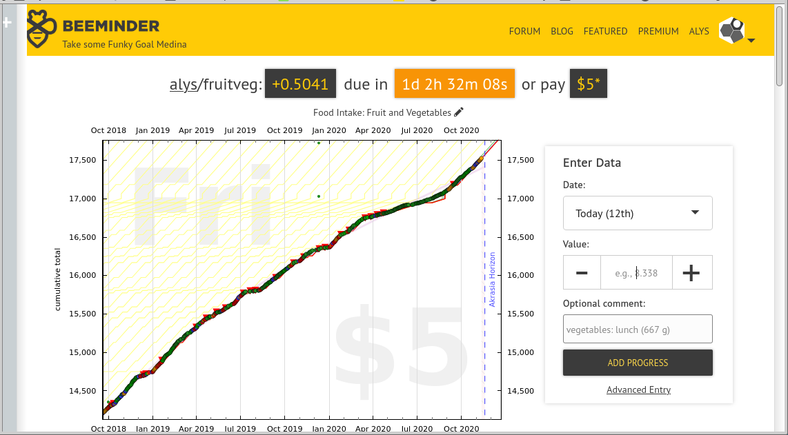
That said, the design for the individual goal page could be more compact. I’m used to – and quite like – being able to see a decent number of recent entries in the data tab without scrolling (about 10 rows), whereas the proposed design looks like it might show two or three rows of data under the graph at most.
Yes!! I use a userscript to make the dashboard even more compact than it already is.
Also, a really nice thing about the current goal page is that it exposes so much data as HTML data attributes and CSS classes, which makes building userscripts and user styles for the page generally quite straight-forward. Hope the new version does the same!
It lets me use Beeminder as a to-do list and send stuff to the bottom once I’m done with it. It’s been a gamechanger for me, as someone with a lot of goals.
(I can grab a link to the extension if anyone wants it – it’s somewhere in this forum – and @dreev might want to consider this a feature request…)
The current beeminder.com seems rather “geek-designed” to me – personally I like that. This redesign signals “professional designer designed this” much more clearly to me. My guess is that will make a difference for inspiring confidence in new users, and that’s what matters!
So I think they both look nice, but you should switch to the new one even if it’s expensive in time and money, so that more people use beeminder.
Maybe you can A/B test it in a limited way? Maybe just a subset of pages involved in signup?
I’m going to Nth the requests for less header and less white space. I have a perfectly decent sized monitor (diagonal about the length of my arm?) and my browser window is sized to be most of the screen, and that header image still takes up a third of my screen
Beyond the header, there’s just an awful lot of white space. It’s undoubtedly prettier (I particularly like the font choices), and I don’t mind it at all for pages I rarely see (the home page, the goal creation page, etc) but for the “bread and butter pages” (goal list and goal details) I value efficiency so much more than attractiveness. In live Beeminder, I can see my top 7 goals (minimized) in the goal list page without scrolling; if you removed the header entirely from the hypothetical design, I’m not sure I could see that many, which means once any reasonable header is added (obviously we can’t go headless!) that number will only go down.
Newby here. It looks great for PC use. However, I plan to use the web based app on my smartphone only. I’m afraid what’s proposed wouldn’t scale. Perhaps both a desktop and mobile version?
I love the public facing designs! The redesigned homepage in particular looks really welcoming and I like how it’s structured.
The internal pages aren’t as information-dense as I would like. My current dashboard shows 9 goals (all collapsed), but the redesign only shows 4. This would be an issue for me as I’m usually in the red for 5 or 6 goals each day and I’d miss that under the new design. Maybe a “power mode” with reduced whitespace and smaller graphs would fix that, kind of like how new.reddit.com has a compact view as well as a spacier one. The new header also takes up 1/3rd of my screen which seems like a bit of a waste.
Overall I think it looks really fresh, but for daily use it would need some tweaks to have the same usability as the current site.
Thanks all for the comments! I definitely agree that probably the app side of the designs need another pass, looking especially at spacing/sizing/information density and reducing the height of the header.


