There are bunch of other before/after shots in the GitHub issue though there I focused on the least impressive examples, to make sure this is Pareto-dominating the old smoothing. There are a couple questionable cases but they’re very rare and only questionable – they’re still arguably better.
Other than the smoother smoothiness, the thing to notice is that the purple line no longer lagged behind your datapoints. Let me know if you want to nerd out about why that is. We may blog about it!
(That lag was actually a kind of a touted feature of the Hacker’s Diet but we believe that everything works just as well without it. In particular, it should still always be the case that as long as your datapoints are below the moving average line, you’re pulling the trend line downward, and vice versa.)
I’m also thinking that this is so much nicer that there’s no value in the so-called rose-colored dots now (if there ever was). So we may be killing those. Speak now or forever hold your peace?
I know I said this in Slack, but I’ll add it here too: some people really hate the stair-steps look and the fact that the lines can cross the bright red line. (This is not something that bothers me, but it is feedback we get every so often.) People use the rosy line not so much, I think, for it being optimistic… but because they want the dots to be joined directly instead of jaggedly.
I think I use it on some of my graphs for that look, too.
Oh, right! We should also note that you can turn off the steppy line altogether. Though I think the most correct solution to the ugliness of the steppy line potentially crossing the bright red line is to make the bright red line also be steppy!
I’d love to see screenshots of graphs where you like the rosy lines…
While the new smoothing looks prettier, I am rather bummed about this. I have this line turned on for weight tracking (is there an actual other use for it?) and smoothing it more takes away the tiny feedbacks you get day-to-day how your choices affected your long-term trend. I know eating kraft mac and cheese for dinner makes me weigh more in the morning, because the little green dot says so, and I know it affects my overall trend a tiny bit, because the little purple line says so. If the little purple line doesn’t say so by showing a sad bump, it is ever so much harder to gauge and learn how things affect my weight. It was also very satisfying to see little happy dips in the line on days where I worked extra hard.
Good feedback! I plan to start paying attention to that on my own weight graph. I’m thinking that we can get similar visual feedback from where toady’s datapoint is relative to the purple line…
As you see, my weight graph is super noisy, but the rosy line there and only the rosy line make the plateau from January to May super clear. The purple line wobbles up and down, but the pink line is really saying the important thing: no net change.
Both start going up recently, so the pink line isn’t hiding that increase, either. You might think that it’s wrong because it’s not taking into account the most recent uptick, but it’s a good thing it’s not because today’s datapoint (not yet entered in the screenshots) took the line back down again.
As someone with a really noisy graph, the rosy lines are more useful than the purple one. The purple one wobbles around like an ECG trace, when the real information is “nothing is really happening”.
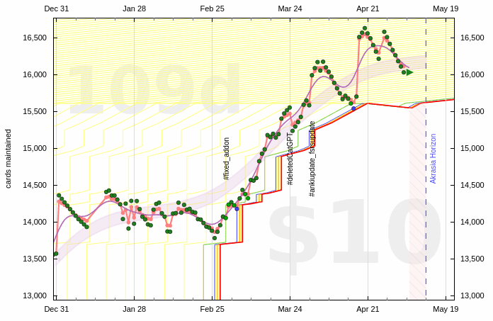
I like that the rosy line is a bit “sluggish” and really only moves down when there is a super clear trend. It takes out lots of the daily noise. E.g., from late March to mid-April 2022, nothing really happened in the big picture: I basically stayed at 8.580 cards maintained, even though the actual count hovered in between 8500 and 8700.
If and when I were to start minding this metric, I’d want to maintain it below a certain level. But a certain level of fluctuation would be expected and the rosy line seems to help in not making me worry about those jumps.
With regards to the smoothing, I think no longer trailing the data is a fine improvement. I sort of get where @trb97horsegal is coming from. Maybe it’s more important that the smoothed line is still able to tell a story than that it’s the best fit or the most pleasing curve… No longer trailing the data does mean the line gets a little more obscured by the actual datapoints, but that’s probably an acceptable trade-off.
But lines like this can’t be fixed soon enough. A definite improvement all around there!
As an aside, I’m seeing this:
I’ve been going through quite some old threads and I’ve noticed a lot of broken image links. I never really looked into it and chalked it up to bit rot. Here’s a thread I don’t see a single image in: Zapminder! Share Zapier-mediated autodata ideas.
The errors are different, however. An Amazon S3 AccesDenied error for the recent one and 404s for the older Beeminder-hosted ones.
Don’t have time to read the thread in detail. I just wanted to give my vote that following the micro-fluctuations in weight is misleading anyway. If you have a big salad at night you will also weigh a lot more in the morning…
Day to day, weight fluctuates too much to really count for anything, which is why the smoothing was helpful. If I could turn off the daily data points to only see the smoothing, I would have. But taking off the immediate impact of the day’s weight on the smoothed line means the impact lags some days which means more days before you realize there’s a problem with something you’re doing which means that you take longer overall to reach your goals. Like the difference between correcting when you start drifting in your lane vs correcting when you start drifting across the whole road.
Reading through the thread, I am not sure why the new version of the moving average line is thought to not reflect the most recent datapoint’s effect. As you might see playing around in Beeminder Sandbox (once moving average is enabled and some datapoints are added), the most recent datapoint does pull the moving average line towards itself. The main difference is that it also causes changes further back than before (wherein only the part since the immediately preceding datapoint was effected). This is an artifact of the forward/backward filtering that gets rid of the delay associated with the previous method.
Perhaps we could address the issue of the new moving average line not reflecting daily trends by increasing the cutoff frequency of the filert (i.e. making the moving average more wiggly?)
One related option is to tune the parameters of the filter to be “more wiggly” for recent points and then smoothly decay to be “less wiggly” in the past (may require hand-coding since presumably this isn’t an option in the filter library?). Although again my personal feeling is that the current behaviour looks good.
Thanks everyone! I’m digesting the feedback. Tentative initial conclusions:
As Uluc says, the moving average line reacts pretty well to new data. I’m not convinced it wants to be wigglier. More parameter tuning may be fruitful and seeing more examples of graphs where you like / don’t like it is great.
If you have the moving average line turned on, you probably want the steppy line turned off. Possibly that’s worth enforcing in the UI, like a radio button: steppy or smoothed. And maybe no such thing as having the moving average without the aura? Choices are bad after all!
Sounds like there’s some demand for a simple connect-the-dots setting but I’m still skeptical. In some cases it looks like people just want the moving average to stand out more. The actual rosy algorithm seems all wrong regardless, though I confess that @ianminds has an example where it looks nice. It would actually help a lot to see an alternative screenshot there with moving average and/or aura instead of the rosy line.
My feeling on this one is that the aura is doing the best job of all. I see what you mean about the moving average not standing out enough.
I’ll add to the yay-sayers and support the continued existence of the rosy line (or an alternative with similar properties). It seems to visualize the last (couple of) datapoint very pessimistically (useful), and visualize long term plateaus in my weight gain goal.
Good feedback! But in this case the purple line looks like a truer reflection of reality and in particular does reflect the recent dip. In this example the pink line both exaggerates the recent dip and also fails to show at all the absolutely genuine dip in March.
I think this actually illustrates nicely why I want to kill the pink line. The pink line is trying to achieve some kind psychological desideratum but it’s at the expense of accuracy and that should never be an acceptable tradeoff!
In case it wasn’t clear, using the rosy line on 1 goal in 8 years is not exactly a fine endorsement…
I made some screenshots comparing it to the other options and then enabled all of them (graph overlays). If it wasn’t for this thread, I’d have nixed the rosy line already. Besides its unclear characteristics (you’d have to read a help page, or the code, to really know what it’s doing), (1) it eventually gets approximated by the running average and (2) it can be really misleading.
Compare these two screenshots simulating the same graph a day apart. If you’re not watching closely you might think you’re staying the same course, but the rosy line “jumps” in response to the higher datapoint. Maybe that even crosses from misleading to lying (to yourself) with statistics. If this were a weight goal, the goal of the rosy line would be to hide some negative information from yourself. I see this line going the way of the autoquit
I’m not sure I agree. Or rather, I agree that the purple line is a truer reflection of reality, I guess, but I don’t think that’s actually useful information. In the long term, that goal looks like it’s just at a plateau, and the datapoints are varying around a set point. The pink line shows this, but the purple line is (for my money) reacting far too quickly to what is just random fluctuation. (With the caveat that this is how my weight behaves and this is the light in which I’m interpreting this graph; not meaning to say anything about anyone else’s weight.)
Admittedly, I find the pink line somewhat more useful in retrospect than for my current data – the “optimism” is not what I’m looking for, but rather the way it can show me a trend in the past, the way it shows out of all the mess that there is actually basically a flat line for the last x days. The purple line doesn’t do that, because it follows the data immediately.
The more I think about it, the more I’ll miss it; the swathe does similar, I guess, except the concept of a polynomial fit is totally meaningless to me, so I’m never sure if I understand what it’s even there for… sorry, I know, not nerdy enough in this area!
I’m not sure about the new purple line yet but one thing that might be good is to update the documentation. It doesn’t seem to be a exponential moving average with .25 smoothing constant anymore!
I was quite confused as to how my purple line could be outside the bounds of my data points but after reading this thread it makes sense.
I’m holding judgement other wise but I’m definitely biased having been a fan of the weighing down/pulling up metaphor of moving average for years:
That being said, other tools do that well so I’m looking forward to how the purple line changes over time!


